Shell Yeah!
TMNT Splintered Fate
the brief
I was brought on by the lovely team at The Trailerfarm to create Motion Graphics for TMNT’s Splintered Fate Release Trailer, enhancing game capture with custom text slates and transitions. The challenge? Designing mostly from scratch with a distinct look and feel, all while navigating Paramount’s IP review—despite having no set guidelines. One of the biggest hurdles was ensuring that the motion graphics connected seamlessly and intentionally with the gameplay capture, creating a cohesive flow throughout the trailer. Super Evil Megacorp gave us some rough direction, but I had to concept each text slate, character splash and transition on the fly in order to stay flexible, as the client wanted plenty of variation throughout the process.
Role: Motion Graphics, Asset Creation, Art Direction
Software Used: After Effects, Photoshop, Illustrator
Client: The Trailerfarm, Super Evil MegaCorp, Paramount, Nintendo
the results
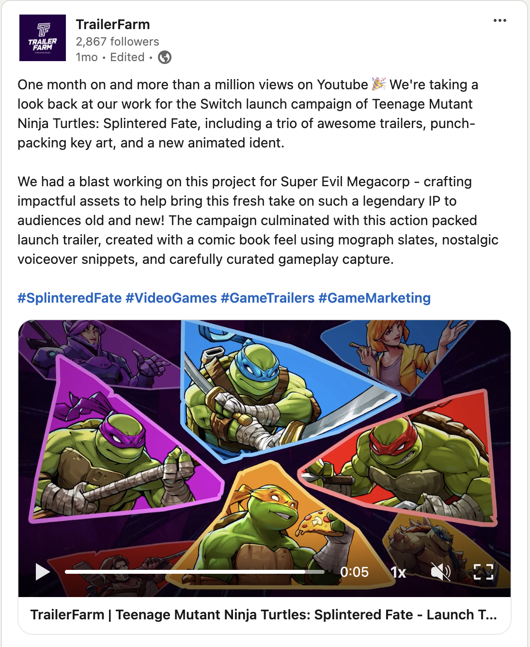
The launch trailer made waves, surpassing a million views on YouTube within just one month. The snappy edit combined bold motion graphics and punchy visuals to captivate audiences both old and new. The action-packed trailer, complete with dynamic comic-book styling and carefully curated gameplay, resonated strongly with fans, driving significant engagement for the Switch launch. The trailer not only elevated the visual storytelling but also helped bring a fresh perspective to this iconic IP, contributing to the campaign’s wide-reaching success.

Crafting the Vision
Text Slate Exploration
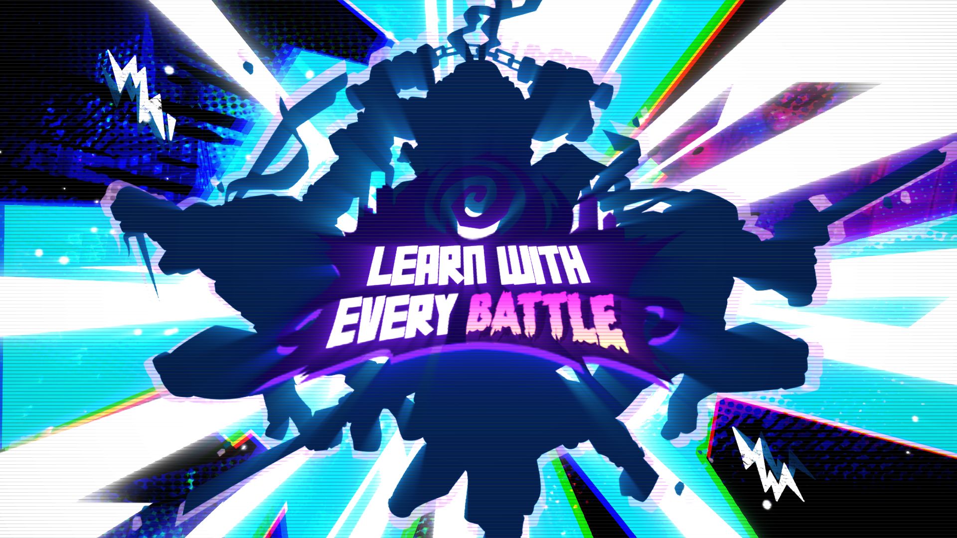
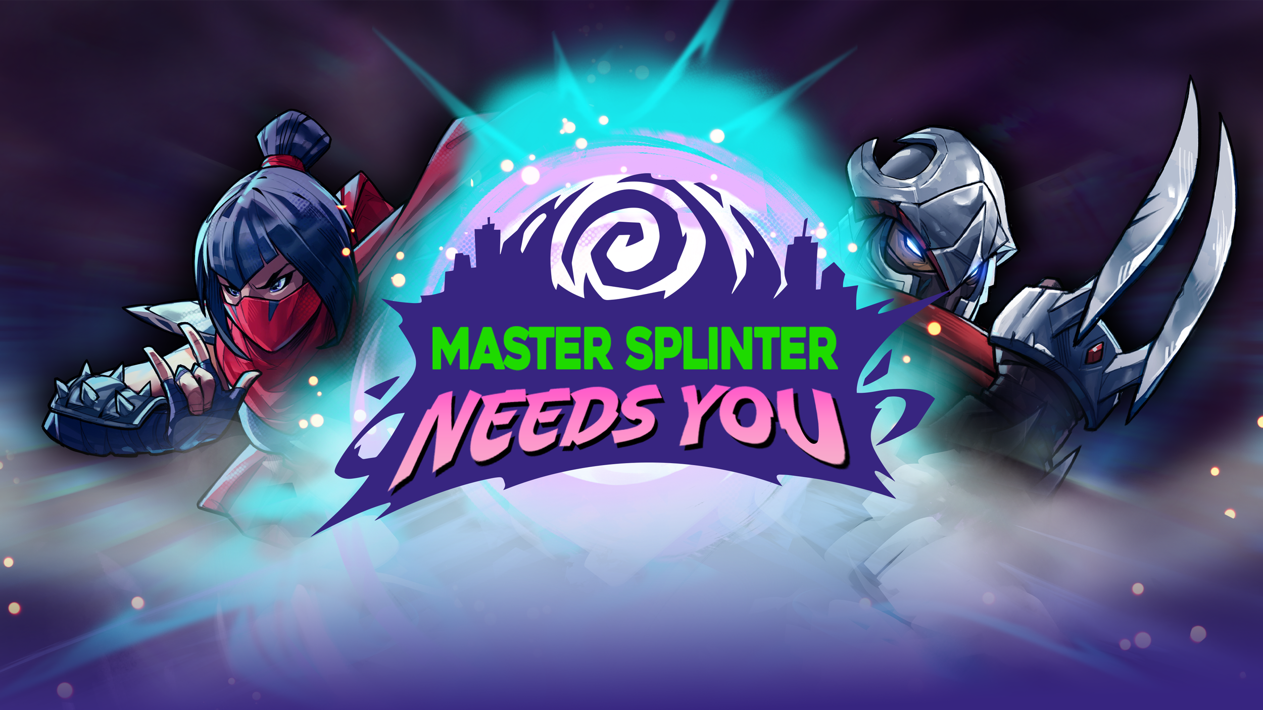
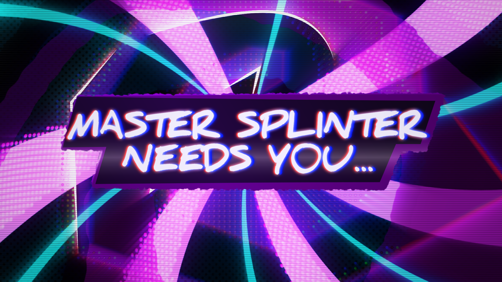
Our first step was to conceptualize the look and feel for the text slates. After several rounds of initial concepting, we landed on Concept 04—a direction that perfectly captured the tone of the game.
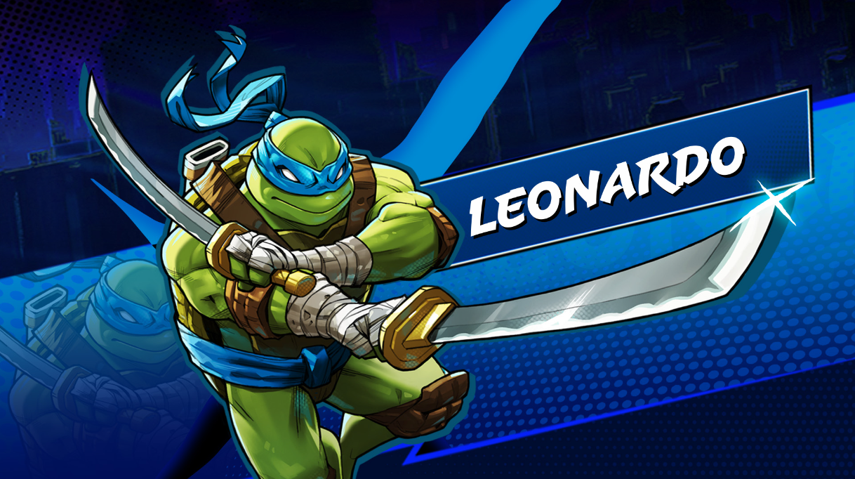
Originally, the plan was to create a single text slate style and reuse it throughout the trailer. However, once Concept 04 was finalized, we decided to elevate it further by introducing character splashes, highlighting each turtle in a unique and dynamic way.

Transitioning with Style
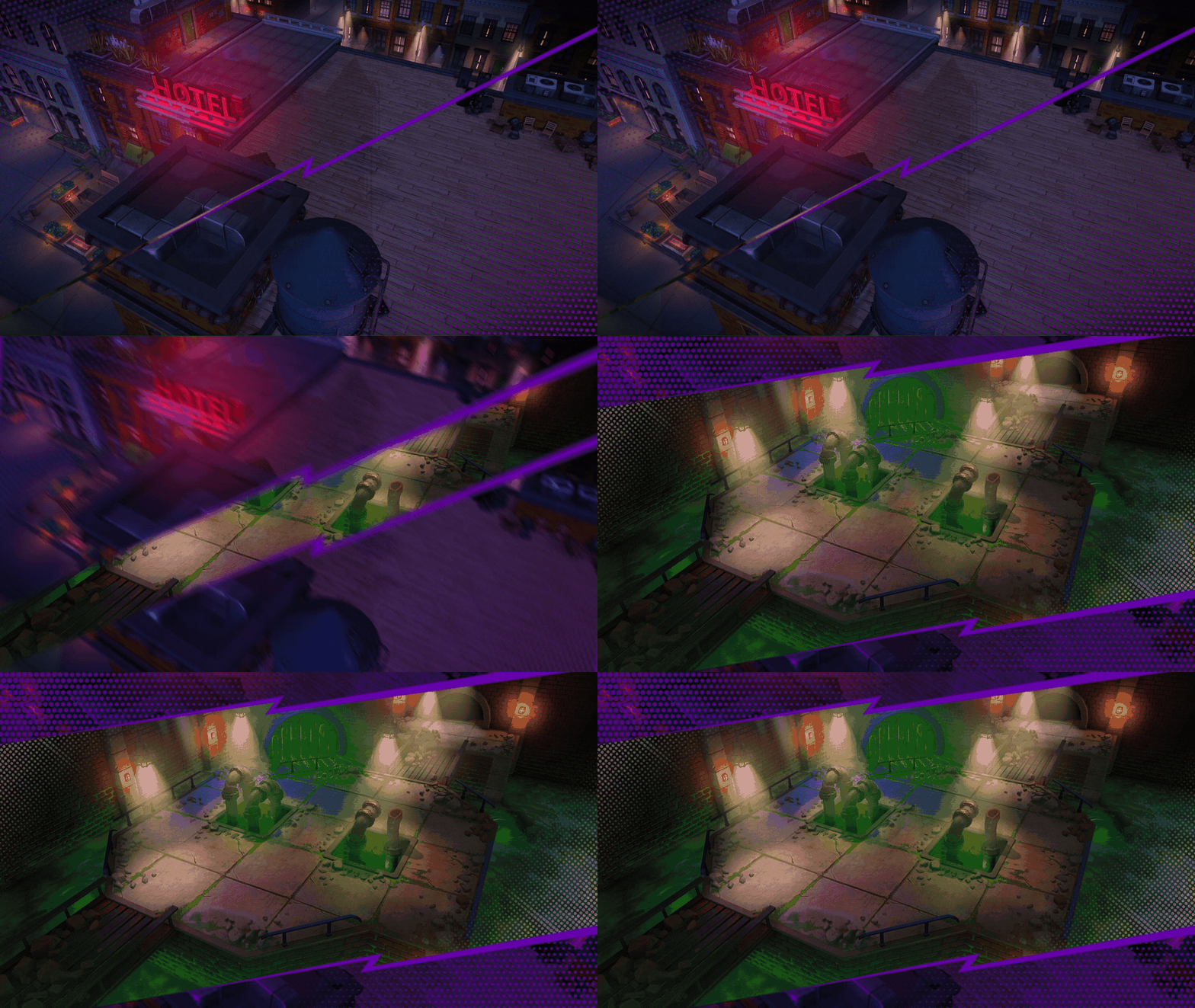
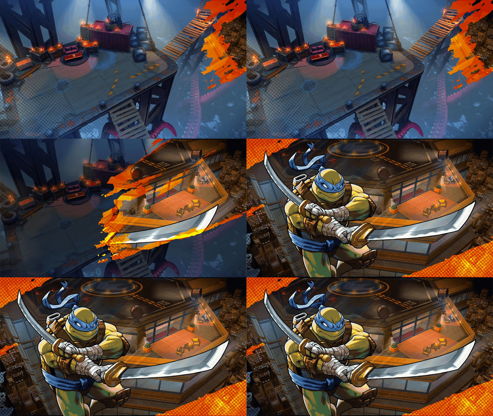
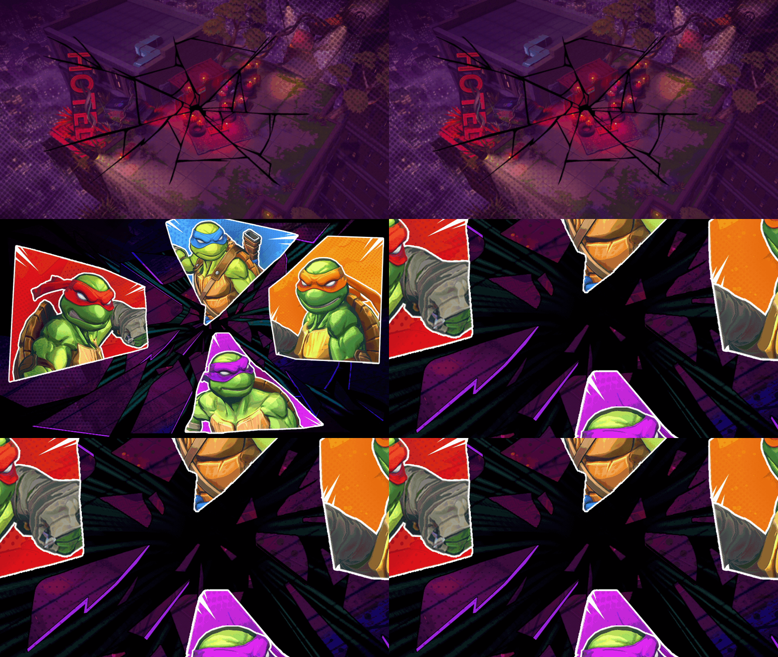
Next up, we focused on concepting transition animatics to elevate the edit. These concepts would serve as seamless cuts between shots and enhance the on-screen character splashes. Below are a few animatic transitions we explored before locking them into the final edit.

Polishing the Details
Polishing the Details
With concepting complete, we began sharing drafts with the client for feedback. Below demonstrates the feedback loop we navigated, making adjustments along the way to align with the clients vision and pass Paramount’s IP review
Leonardo
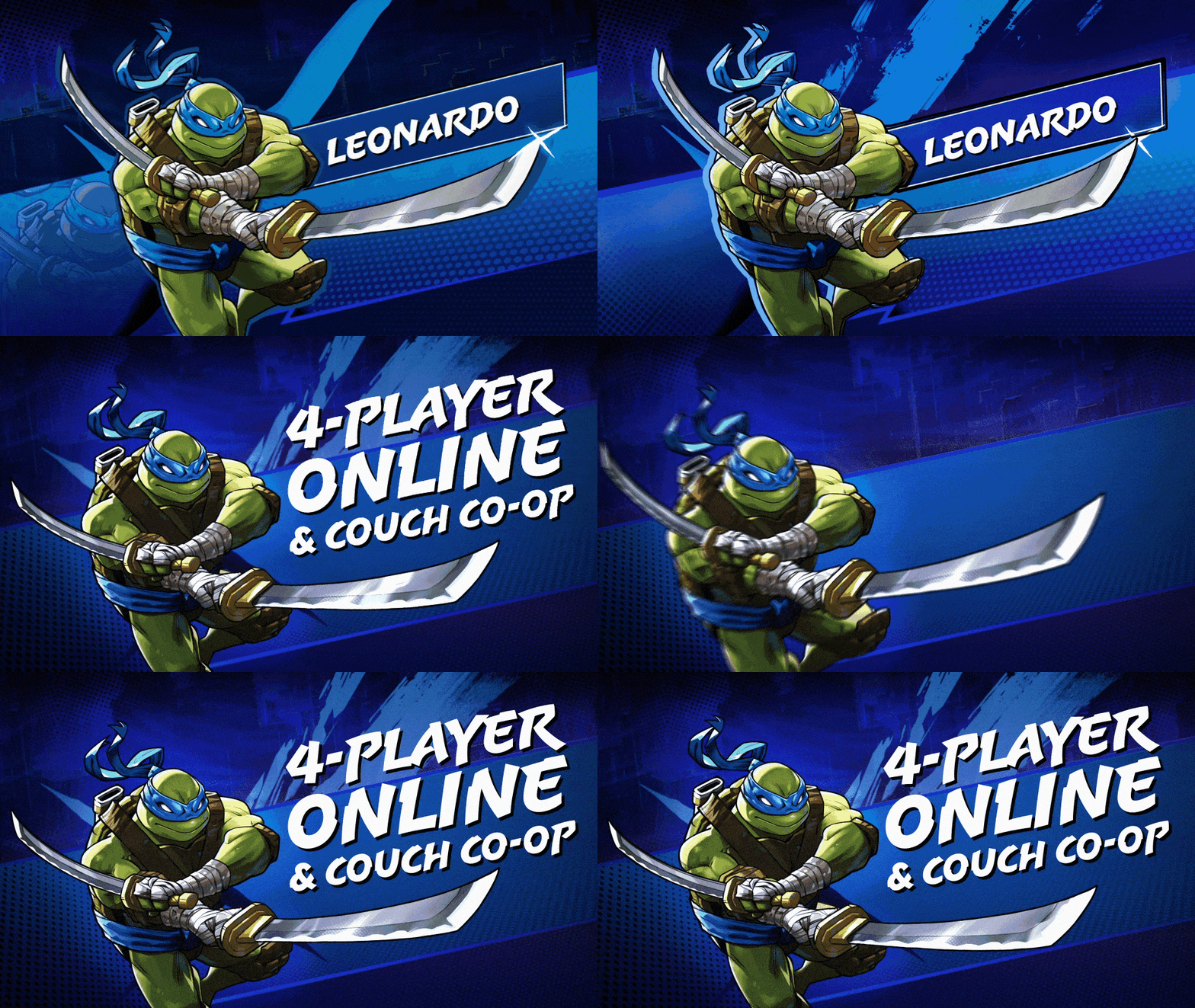
We focused on perfecting a single text slate design to establish a cohesive visual language across all assets. Leonardo's slate was selected as the prototype for this process. Key refinements included:
Texture Integration: Introduced a gritty paint brush stroke texture and vignette, enhancing contrast against the background.
Background Enhancement: Removed reflections to create a cleaner backdrop.
Typography Emphasis: Eliminated the text box, allowing typography to occupy more screen space and share focus with the character artwork.
Colour Correction: adjustments to Key Art colours to better intergrate Leonardo in to the backdrop.
raphael
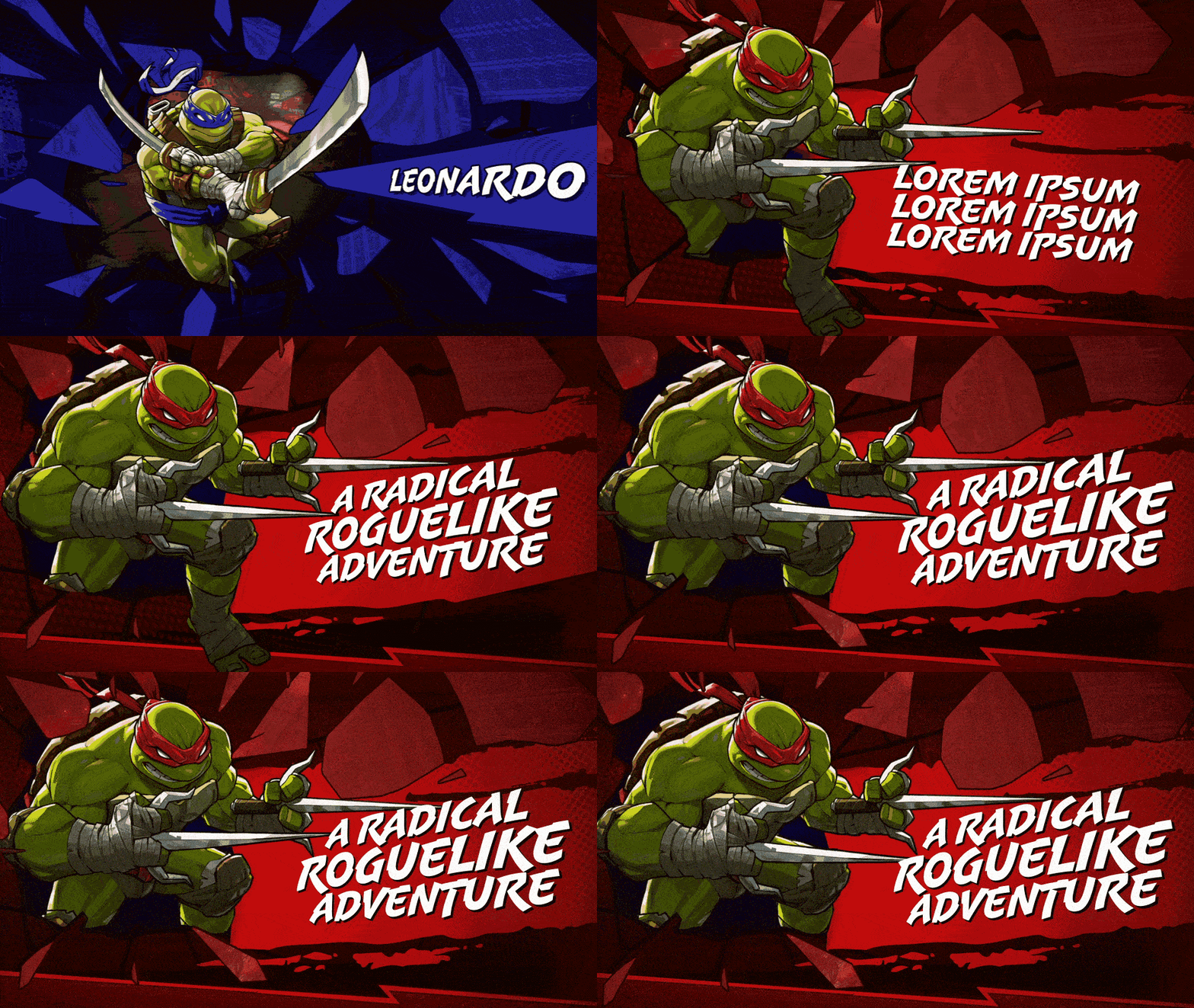
Raphael’s concept took inspiration from Concept 05 during the text slate exploration, where key art shatters through the screen. Building on this idea, I redesigned the slate for Raphael and worked through client feedback to refine the look. Key adjustments included:
Color Correction: Blending Raphael’s key art more seamlessly with the backdrop.
Graphic Refinement: Shaping the shards and wall break for optimal visibility of key art while maintaining text clarity.
Typography Emphasis: Removing the text box to let the typography command more screen space, sharing focus with the character art.
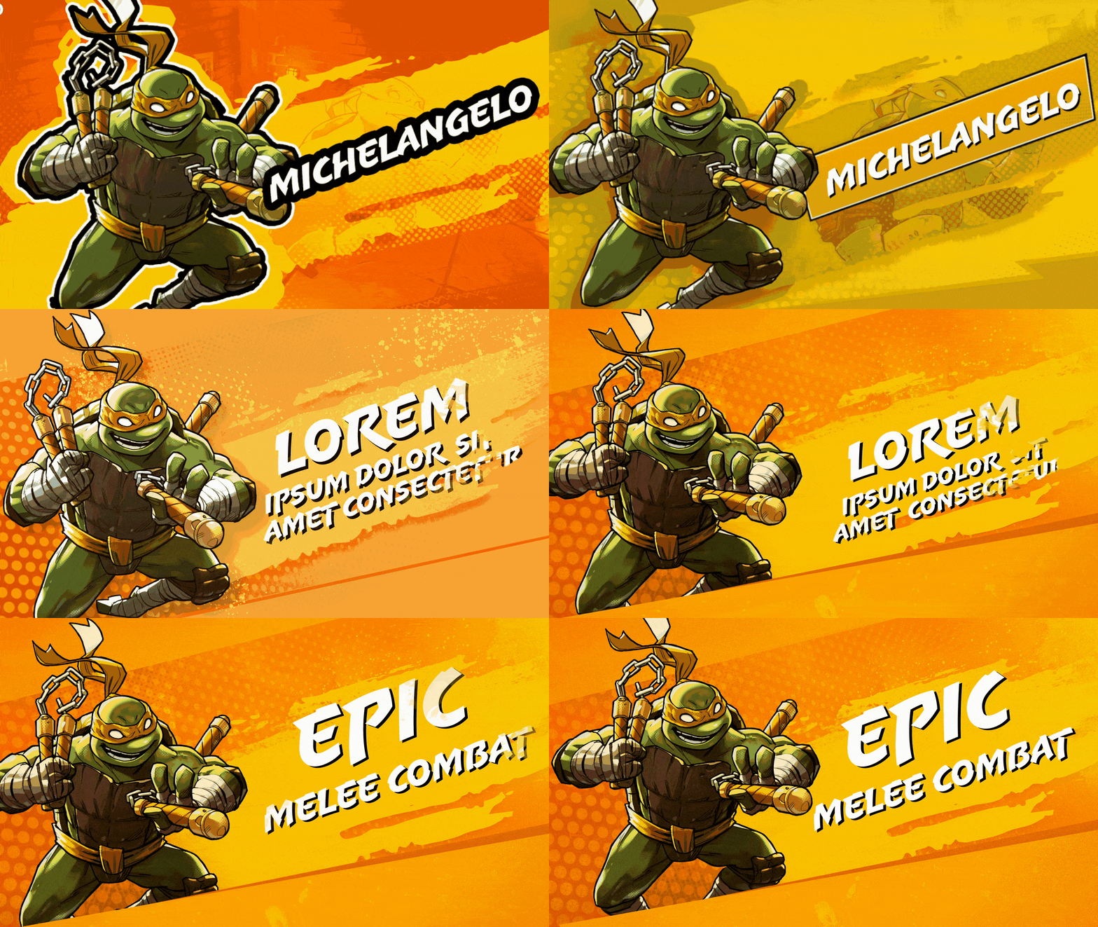
Michelangelo
Michelangelo's text slate evolved through multiple versions, initially taking on a comic book feel with bold outlines and saturated colors. It was later refined to align better with the other slates, with key updates including:
Color Corrections: This slate saw the most color tweaks, as the client explored various options. We settled on a mid-saturated orange and yellow to make the key art pop against the background.
Graphic Styling: Adjustments to the key art, including an added leg to Mikey and alignment tweaks to his pose.
Typography Emphasis: Removing the text box allowed the typography to take up more space, sharing the stage with the character art.
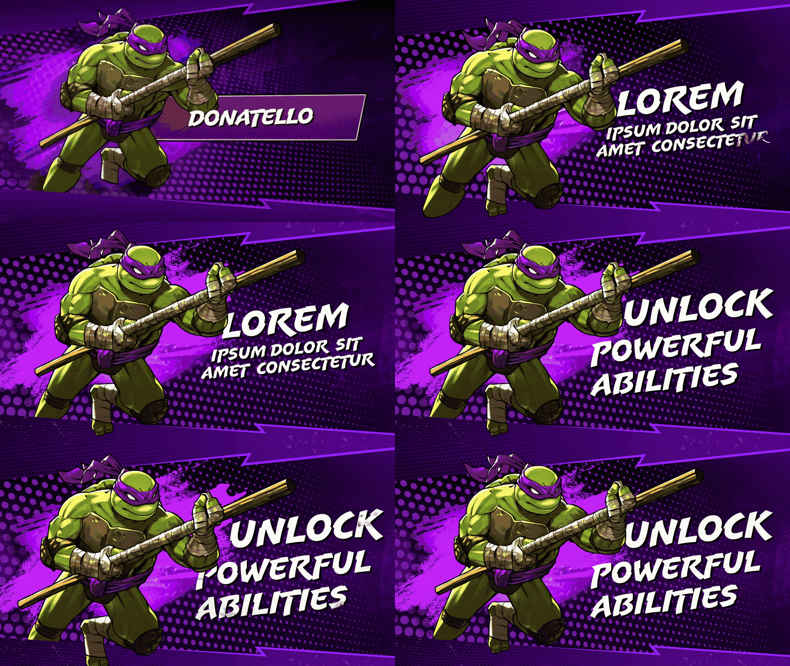
Donatello
Donatello’s text slate required minimal revisions, aligning seamlessly with the other designs. Key adjustments included:
Key Art Adjustments: Significant paint-over and tweaks were made to animate Donatello in the way that was required.
Typography Layout Refinement: Multiple layout adjustments ensured a dynamic typography that complemented the energy of the key art.
Concept Unification: Larger halftone patterns and color corrections brought this slate in harmony with the others and seamlessly matching the backdrop.

honing transitions
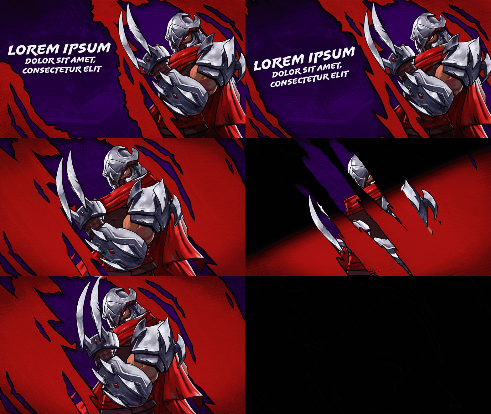
shredder
We needed a powerful transition to introduce Shredder, the main villain. Initially planned as a text slate, the idea evolved into a transition effect instead. I created several versions of a “rip” effect to frame the type, ultimately settling on a transition that places Shredder in center, and a focus on creating a 2.5D illusion. After a few rounds of feedback, we landed on a final version that captured the intensity the client envisioned.
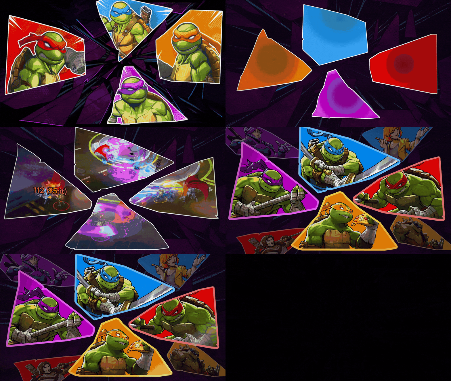
shards
For the last shot, we wanted maximum impact for the transition to the endframe. Revisiting Concept 03 from the transition design phase, we explored various shard shapes and compositions, experimenting with gameplay and character inserts. Through rounds of feedback and refinement, we achieved a final look that I’m incredibly proud of.

conclusion
This project brought the challenge of merging dynamic motion graphics with iconic characters, delivering a trailer that honors the TMNT legacy while adding fresh energy. From initial concepts to final refinements, each element was crafted to create a seamless, impactful experience—one that both fans and the client could be proud of.

